
NASA Worldview Redesign
Redesigning NASA's remote sensing GIS dashboard for non-GIS-experts like journalists. I propose streamlined workflows and commercial data service design, using storytelling of a persona that uncovers environmental stories hidden in Earth observation datasets.
Context
MDes IxD Project: Service Design and Systems
Role
UX Researcher & Designer
Tools
Figma, ArtCenter Research Library, OpenGIS
Timeframe
Full Semester (14 Weeks)
Deliverables
Dashboard Redesign Prototype, Persona, Service Blueprint, Pitch Deck
The Challenge
A powerful tool that grew past its users
NASA Worldview is a geospatial information system that lets visitors visualize Earth through 1,000+ data layers collected by overhead sensors across multiple decades. It is a genuinely powerful platform. But over the years, that power came at a cost: the interface grew complex and reportedly unwieldy for users who aren't GIS specialists.
This was personal for me. I at Jet Propulsion Laboratory, I've seen firsthand how capable tools lose adoption when the interface doesn't meet users where they are due to years of increasing scope creep. Worldview had the data. It had the mission. But it got even more data as remote sensing technologies scaled. What Worldview needed was a revisit with a human-centered lens on its interaction design.

2 Main Project Phases
This semester-long project in ArtCenter's Products, Services & Systems course unfolded in two phases that mirror how I approach design challenges in my professional work: understand the system first, then extend it.
Phase 1 evaluated the existing dashboard, built a research-driven persona, and redesigned the UI with a new analysis module.
Phase 2 zoomed out to service design, exploring how commercial satellite data could be integrated into Worldview to unlock entirely new investigative workflows.
A single persona, Mikayla R., threaded through both phases as the narrative backbone, grounding every design decision in a real user scenario.
Process: Research to Testing to Persona
Three research streams:
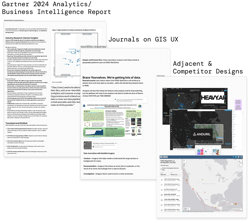
I took a 3-prong secondary research approach that converged on three key GIS user needs: Integrated Data Exploitation, Collaboration Features, and Workflow Optimization.
Gartner's 2024 Analytics & Business Intelligence Report highlighted industry-wide trends around self-service analytics and the expectation that dashboards should reduce, not increase, cognitive load. GIS UX journals provided specific guidance on spatial interface patterns, pointing toward layout principles that prioritize map real estate while keeping tools accessible. Adjacent and competitor designs revealed how platforms like heavy.AI and others were handling similar data density challenges.
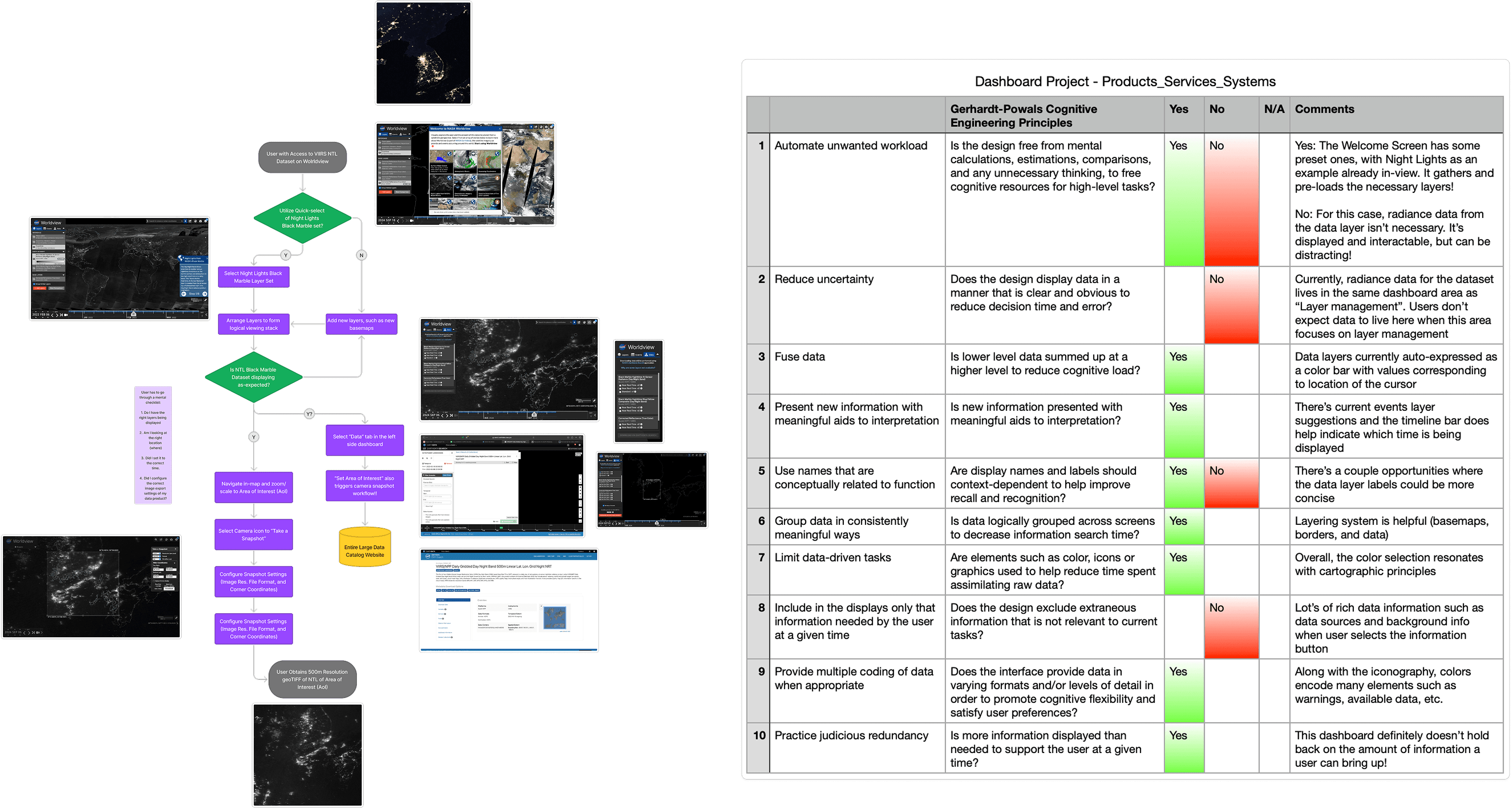
User Testing: Task Analysis Revealed Redesign Opportunities
Phase 1 of the semester also included time to evaluate the existing NASA Worldview Dashboard with peers in the class. A Cognitive Task Analysis (CTA) was practiced, where I was able to observe others (3 of my non-GIS-experienced classmates) attempt basic tasks such as map layering and data export while also using a think-aloud protocol where the participants verbalized their thoughts while performing a task. Testing also included 2 data journalists from my network as well as 2 data scientists that have moderate proficiency using GIS tools like Worldview.
Research and Test Informed Primary Persona
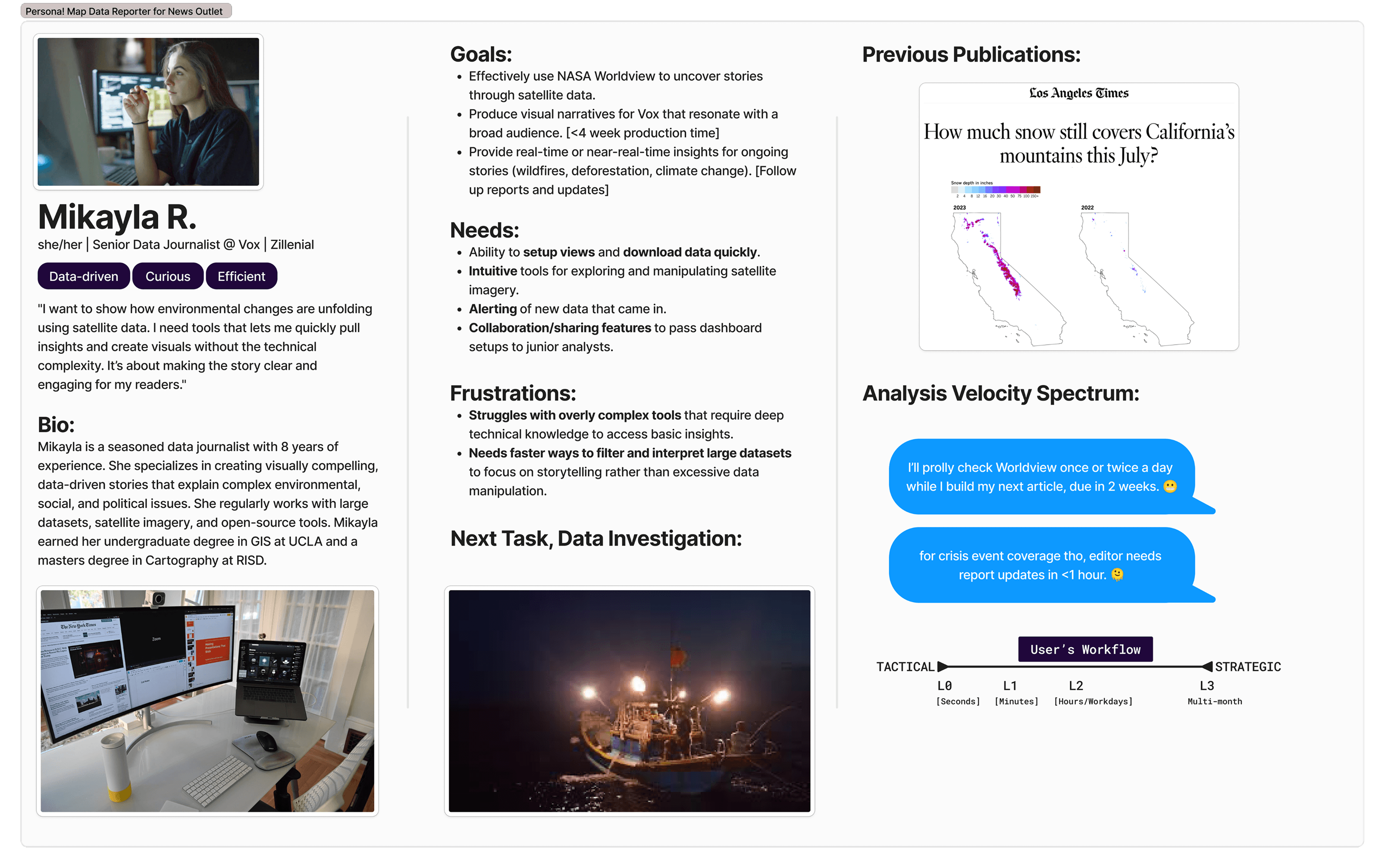
The research findings crystallized into a persona that would drive the entire project. Mikayla R. is a seasoned data journalist who uses satellite imagery to tell environmental stories for a major news outlet. She's data-driven, curious, and efficient. Her next assignment:
"I need to show the stark increase in unregulated nighttime mass fishing in South Korea's coastlines."
She needs a GIS that has an intuitive setup-flow, analysis and reporting capabilities, and sharing features. This wasn't an abstract persona exercise. Mikayla's workflow requirements mapped directly to the three research insights, giving me a concrete scenario to design against at every decision point.
A Refreshed Dashboard and Analysis Module
Designing for situational awareness
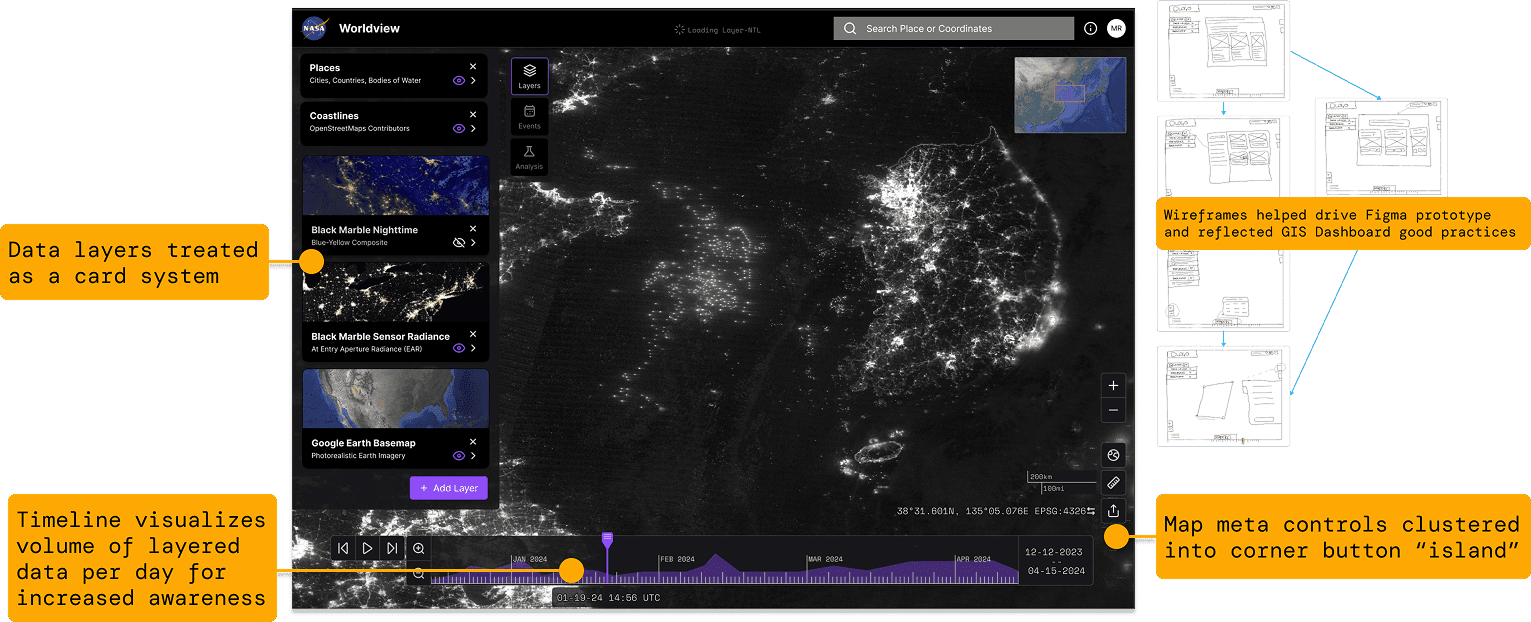
The redesigned Worldview UI was driven by established GIS layout good practices. "Floating islands" containerize fundamental GIS tools like navigation controls, keeping them accessible without competing with the map canvas for attention. The design is compliant with NASA's Stellar Design System and Brand Guidelines, grounding the prototype in the enterprise ecosystem it would actually live in.
Iconography selection, information clustering, and a card-based system emerged through heuristic evaluation and iterative user feedback. These weren't cosmetic changes. Each decision aimed to increase situational awareness: helping users understand where they are in their workflow and what actions are available without hunting through nested menus.
Giving Worldview an analysis brain
The biggest feature addition was a new analysis module. GIS research and remote sensing community trends identified key analysis types that users needed: watchbox monitoring, temporal comparison, change detection, coincident imagery, and spectral analysis. Each analysis becomes a shareable card that automatically configures the needed layers, reducing the setup burden that often derails non-expert users.
Another major usability finding drove a critical design iteration: geospatial analysis types were not familiar to many testers. Instead of burying options in a dropdown, I designed a full menu with visual previews that provided context for each analysis type before users committed to selecting one.
Usability tests included a data journalist, GIS professionals, and design students, giving me signal across different expertise levels.
Extending Worldview Through Service Design
From "when and where" to "who"
Phase 1 gave Mikayla the ability to answer when environmental events happened and where. But the next logical question in her investigation was who is responsible for the nighttime fishing activity. That question couldn't be answered with government satellite imagery alone.
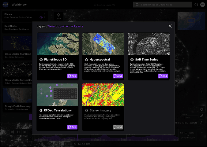
Commercial satellite providers have rapidly proliferated, and their datasets are insight treasure troves. Phase 2 explored what it would look like to integrate commercial data sources into Worldview as a new service layer, focusing on RFGeo as an example product. RFGeo identifies and locates vessels from space by detecting their signal emissions, which would let Mikayla correlate the light signatures she found in nighttime imagery with actual ship identifications.
Mapping the service ecosystem
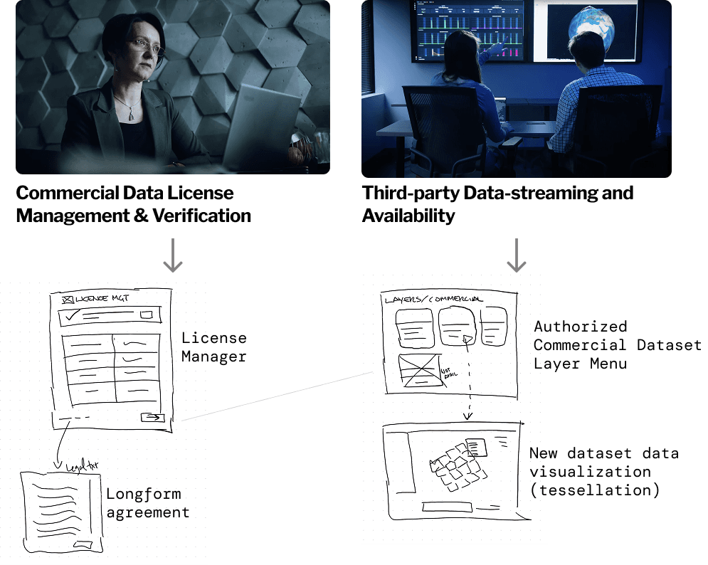
Designing this integration required thinking beyond UI. I developed a service design blueprint that identified new backstage players and touchpoints: commercial data license management and verification, authorized dataset layer menus, new data visualization formats for vector tessellation, and third-party data streaming availability.
The blueprint mapped the full flow from Mikayla revisiting her Worldview dashboard, verifying her commercial data license, selecting and loading the RFGeo dataset, discovering new insights by associating ship lights with signal identifications, and saving her findings to share with her editorial team.
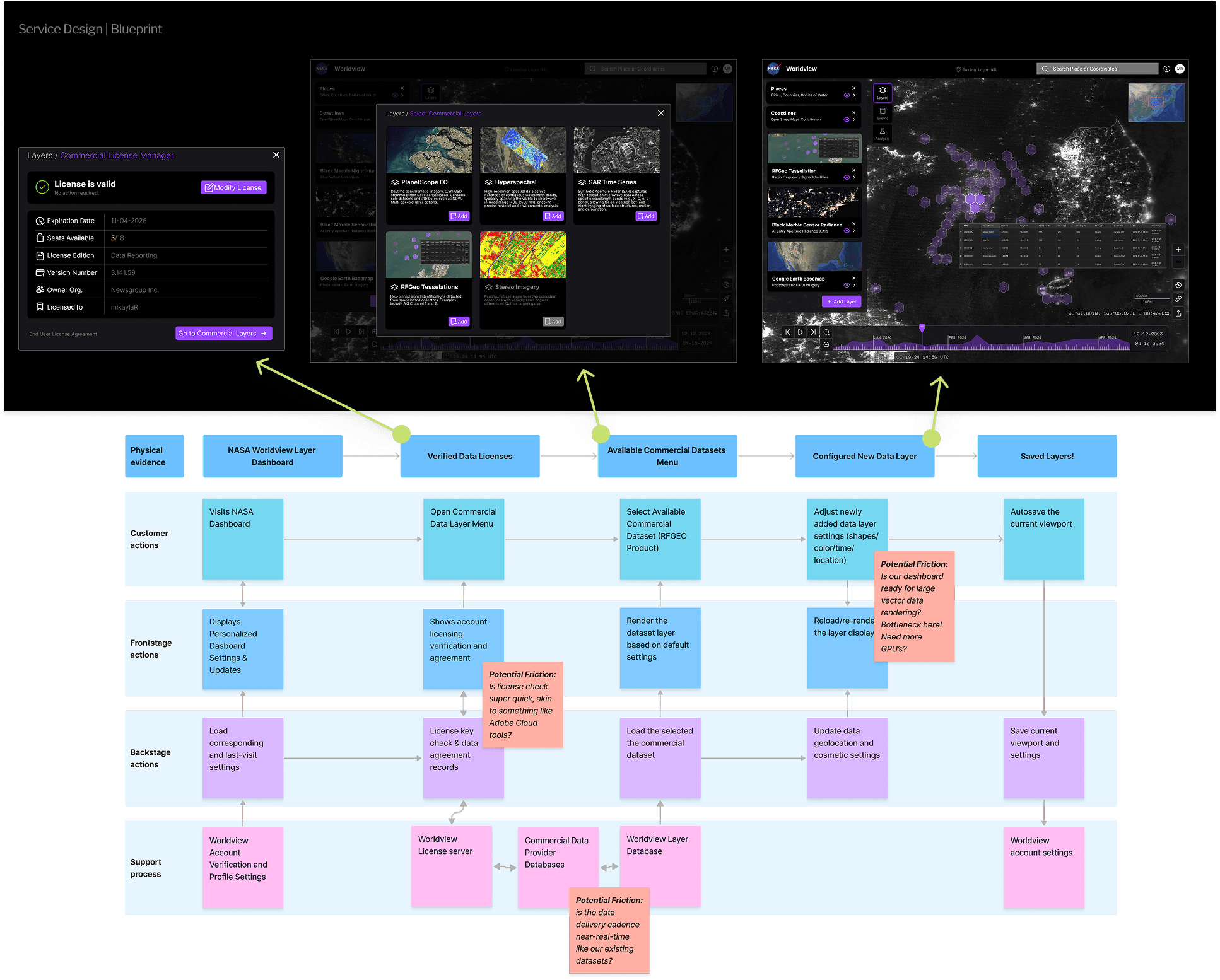
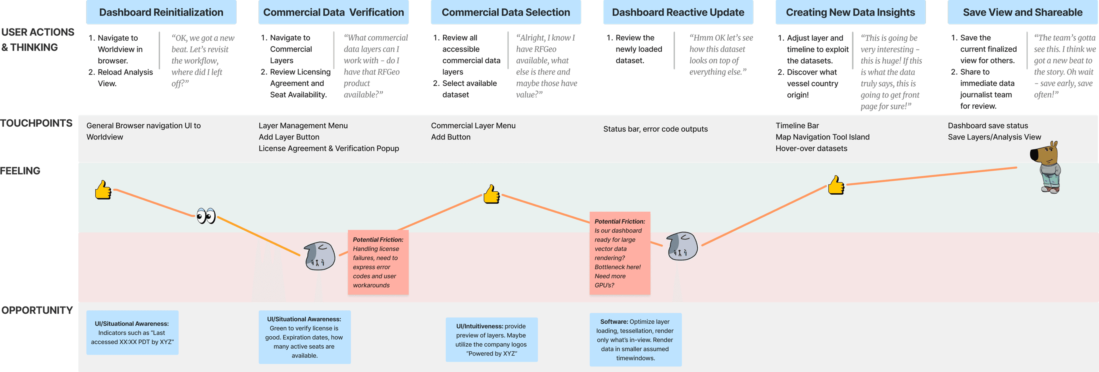
Friction points became design opportunities
A user journey map captured Mikayla's updated mental model for working with the new data source. Friction points revealed concrete opportunities to improve touchpoint designs: situational awareness indicators like "Last accessed XX:XX PDT by XYZ," green verification states for active licenses, preview capabilities for unfamiliar commercial layers, and optimized rendering for large vector datasets.
The competitive analysis positioned Worldview's proposed service against other platforms in the ecosystem, clarifying the value proposition: fusing commercial data into Worldview empowers users to make better decisions in environmental monitoring and resource management, with 10+ commercial remote sensing providers accessible through optimized big-data vector workflows on a persistent online platform.
Impact
Mikayla's Story Comes Full Circle
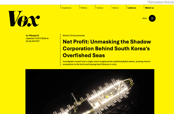
The project concluded with the story that started it all. Using the redesigned Worldview with both government and commercial data layers, Mikayla uncovers the shadow corporation behind South Korea's overfished seas. Her investigation, powered by the tools we designed, becomes a published exposé.
The simulated article seen below acted as a powerful storytelling narrative that drove the final presentation of the semester and also validated that the end-to-end experience, from dashboard setup to analysis to sharing, could support a real investigative workflow.
Reflection
What this project taught me
Usability testing challenged my biases. The majority of feedback from users questioned elements that I thought were "good practice" design. The analysis dropdown-to-preview-menu pivot was the sharpest example: what felt efficient to me as someone with GIS familiarity felt opaque to the people I was designing for.
Dark mode editing is deceptively hard. My dashboard design had very stark color variations across different screens (OLED vs. Studio Display vs. tablet). Deploying a prototype to other people's machines surfaced a problem I never saw on my own monitor.
Documentation leveled up. Multimedia boards in FigJam helped me gather resources from anywhere, creating a persistent research nexus that I could reference throughout both phases.
This class expanded how I source research. Annual design studies and trend reports from firms like Gartner were worth citing and added significant value, especially strong statistics that helped justify design choices. Current-day GIS dashboard UX reports gave me a starting point backed by already-completed user testing.
Connecting this to the day job
While this was a class project, the parallels to my work at JPL and past employers run deep. I evaluate complex technical dashboards, advocate for non-expert users within engineering-first organizations, and design at the intersection of government data and operational workflows every day. Worldview gave me a space to practice those skills with the rigor of a design program and the freedom to push further than operational constraints usually allow.
The journalist and fictional scenario represented similar scenarios I led in real life! When it came to high stakes presentations of the products I manage, I let the user speak to the story, sometimes encouraging them to lead the presentation at the podium. This made our products much more human, directly connecting engineering community with the end users and their impact.